
I think we’ve all become macroeconomic experts since the outbreak of Covid and the pandemic gave us time to reflect and invest in ourselves, and our financial knowledge. It’s great to see financial literacy improving and people feeling empowered to understand our admittedly complex financial system.
Yet part of embracing that knowledge is recognising the limitations of it and when there are events that are beyond our control to fully predict.
I do think that by dissecting several deeply misunderstood measures for the state of the economy and the stock market, we can arrive at a set of guidelines that allow us to understand when the market really is in danger and what the warning signs are.
This article is going to start with the Yield Curve and why using it to understand where the economy is going needs to begin with a deeper reading of the historical record.
In future parts of the series we will cover employment, the “big four” macro indicators, net liquidity, and fiscal flows, as well as the stock bond correlation.
Yield Curve as the Market Understands it
The yield curve shows the relationship between the overall interest rate and the time to maturity of the debt for a given borrower in a specific currency, specifically for government bonds. The 10-year and 2-year “yield curve” is the difference or spread between the yields in 10-year government bonds and the yields in 2-year government bonds.
When it is inverted it means that the spread is negative, and it means – practically – that 2-year government debt is yielding more than 10-year government debt by an amount roughly equivalent to the spread.
The market believes that it is a forecasting tool with 85-90% accuracy, and you see charts like this galore across the Twitterverse (or X-verse):
Stock Charts David Huston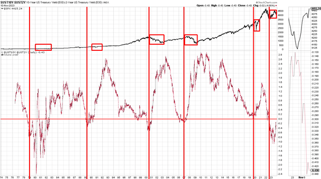
The devil is always in the detail. The reality is that you should look at each instance of the inversion and understand how four things are operating at those moments in time:
- The yield curve, either 10-year 2-year or 10-year 3 months differential
- The S&P 500, performance of the benchmark stock indices
- Trend for Yield Curve, whether it is upwards or downwards sloping
- Reversal of Yield Curve, has it had a sudden +1% reversal within 6 months
Why we look at these things will be the subject of this article, and we’ll conclude with a much better understanding of the yield curve and what it predicts, or forecasts, about stock prices.
We’ll also debunk the myth that “an inverted yield curve” means a recession is 85-90% likely or imminent, and you should simply sell stocks and be in cash.
Detailed Reading of the Yield Curve
2019-2020 Covid Crash
Stock Charts David Huston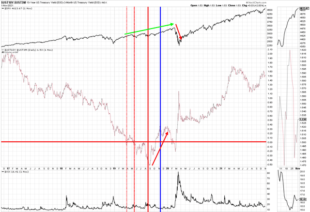
I traded through the Covid crash and actually managed to hold onto my gains from 2017-2020. I can testify that a lot of that was luck and recognising the major impact Covid was going to have. However, if you look at the yield curve, it had you out of the market consistently early. The crash happened after a nearly 1% un-inversion, so very late. The cause of the crash also was a specific pandemic event (essentially unpredictable).
2006-2009 – Global Financial Crisis
Stock Charts David Huston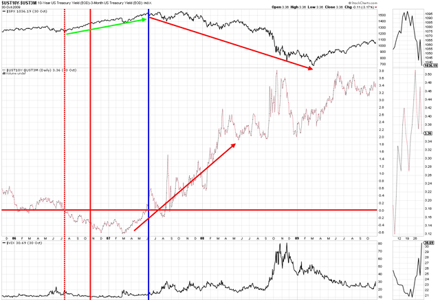
The signs of the global financial crisis began to surface in late 2006 and early 2007. The yield curve had been inverted for a while, and the market stormed higher. Volatility was low. The market did not turn until the yield curve had un-inverted by 100+ basis points. That marked the top.
2000-2003 Dot Com Crash, 9/11, Iraq and Afghanistan
Stock Charts David Huston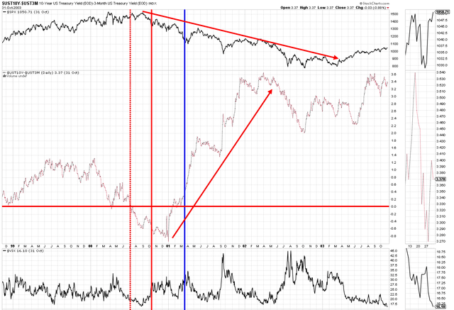
The Dot Com crash actually had a mini inversion in 1998. However, I have excluded that because it was not persistent, the curve quickly re-inverted. Here we can see the deeper inversion in 2000-2001. When the curve un-inverted it marked the start of a vicious bear market in equities.
1990 Recession and 1st Gulf War
Stock Charts David Huston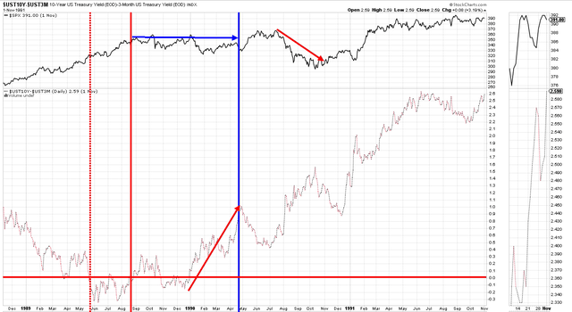
The 1990 recession and short bear market dip occurred a long time after the inversion. It actually happened after the un-inversion, so very late. The market dropped in line with the 1st Gulf War and quickly rose back, confusing investors as we entered recession.
1979-1982 Inflation Stagflation
Stock Charts David Huston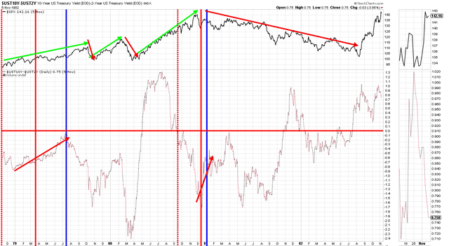
I have used the 10y-2y differential for this period to get the data. What’s interesting here is that this period is similar to what we have today. Persistently high inflation and a very hawkish Fed, along with weak consumer sentiment and uncertainty.
What really happened is that the curve was deeply negative for years, confused investors and the market yo-yo’d around. A lot like today. It inverted in 1979, the market fell twice, many months after it made a breakout towards un-inverting. It inverted several times again, and the big – slow – crash happened during 1982 after several periods of up/down curve.
Summary of the Record of Inversions
In simple terms, let’s look at all the inversions and the path of the stock market over 6/12/18/24 months post inversion.
Let’s also consider whether the falls – if they occurred at all – happened at first inversion, 3 months after, or following the un-inversion of the curve:
EFG International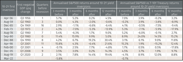
If we take a performance view of all inversions, the record is not as clear-cut as it appears. The average performance 3 months before inversion is -5.8%, or consistently negative. The average performance 3 months after an inversion is 3.21%, which on an annualised basis reflects a 13.5% return. Looking 6 and 12 months out, across the board, the historical record suggests that they are overall positive (11.8% annualised 6 months out and 11.9% 12 months out).
Finally, the frequency of negative returns from the 1956-2020 data is:
- 27% negative 3 months after
- 36% negative 6 months after
- 36% negative 12 months after
If you had sold and went to cash at the “first outbreak” of yield curve inversion, you would have lost money in the 1979-82 period, been flat (at best) in the 1990s, correctly made money in 2000 if you held fast and waited a long time (by chance), lost money for first 18 months in 2007-8 until GFC kicked off, and finally lost money for a while but cashed in big during Covid if you managed to wait that long.
In all five instances of yield curve inversions assessed above, the stock market fell – if at all – after the yield curve un-inverted by 90-100+ basis points and did not necessarily do that on a consistent basis with long and variable lags in time (J Powell reference!)
|
1979-1982 |
2020-2023 YTD |
 Stock Charts David Huston |
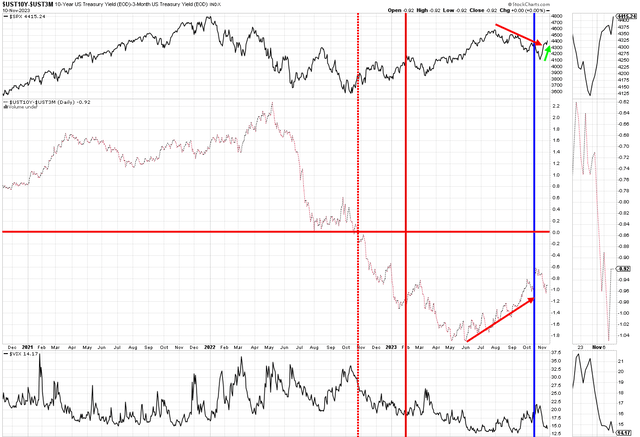 Stock Charts David Huston |
I would not be surprised to see a scenario like the 1979-82 period play out, or alternatively, the non-yield curve inverted post-war 1945-49 period. In both cases investors fretted over macroeconomics, sentiment was extremely poor, and the market had more than 2 up-and-down bounces of >10%. Shrewd investors will a long time horizon bought the dips and lightened up on large swells in stock prices.
Certainly, the obvious market opinions – that a recession was imminent in 2022, and would materialise in 2023, were incorrect. Now that the yield curve is un-inverting we will be watching this closely for signs as to whether it follows a 1979-82 trajectory or a secular bear market like 2000 or 2008. As of now, the data is not clear which way it heads.
Read the full article here